Comparative Visualization and Analytics Comparative visualization and analytics refers to the process of understanding how different datasets are similar or different. Such characterizations may occur at many different levels: image to image, dataset to dataset, derived quantity to derived quantity, and methodology to methodology. Image comparisons quantify the differences in images produced by a visualization process. Entire or subsetted datasets may be compared to one another. Derived quantities could be statistical moments of data fields or topological characteristics like the number and distribution of vortex cores. Methodology comparisons involve quantifying the differences in experiment or simulation parameters, or the differences in "recipe" to create an analysis or visualization result. Our work in this area will be driven by specific stakeholder needs as well as based on development of new metrics for data correlation. A fusion stakeholder has requested the ability to perform time-critical comparisons of fusion experiment and simulation data to guide experimental setup. To do so, we will implement "synthetic diagnostics" to support comparison of experimental and simulation data. This technology is critical in projects with evolving codes (astrophysics, accelerator modeling) in terms of verification and validation: new code results must be compared against baseline results to confirm correctness. Derived quantity comparison is crucial for some stakeholders (combustion, astrophysics, and climate) where the number and distribution of features in simulation data change as a result of parameter studies: these projects seek to understand the effect of parameter changes on resulting simulation output. One of our comparative visualization approaches will leverage and tailor to stakeholder needs is called VisTrails. VisTrails is a new system that enables interactive multiple-view visualizations, and provides a powerful framework for comparing visualization results with highly customizable parameter changes: e.g., mesh discretization, isovalue or any other parameter (including user-defined visualization pipelines) for comparison. This important new capability to perform quantitative �A vs. B� comparisons is also implemented in the VisIt production visual analysis application. (below)
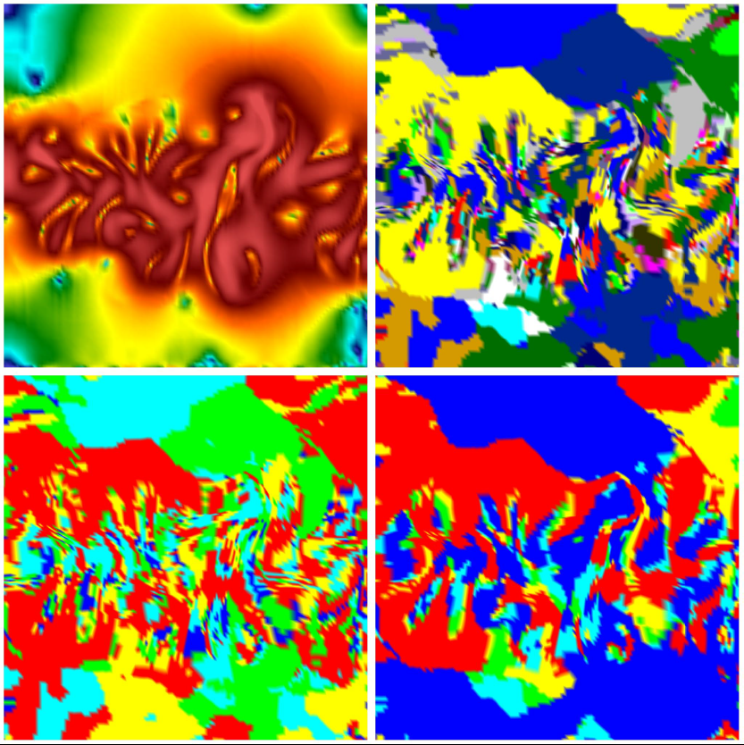
The upper left image shows a 2D slice from a single simulation colored by velocity magnitude. The upper right image is colored by the ensemble simulation index having the greatest velocity magnitude at each grid point and shows that no one simulation dominates. The lower left image is colored by buoyancy coefficient at each grid point of the simulation having maximum velocity. It indicates the buoyancy coefficient parameter is not significantly related to maximum velocity. The lower right image is colored by turbulent viscosity value at each grid point of the simulation having maximum velocity. It suggests that high velocity values are strongly correlated to very low (blue) or very high (red) turbulent viscosity coefficients. See Gallery: Software |
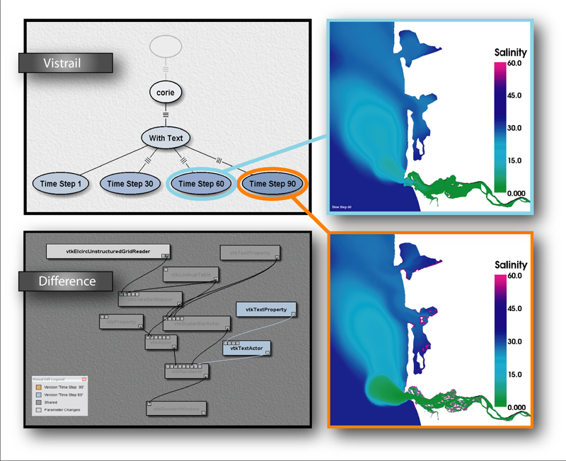 VisTrails is a system for recording ordered actions for the purpose of later comparative analysis. The example shown here illustrates the difference in workflows used to produce two different visualizations. 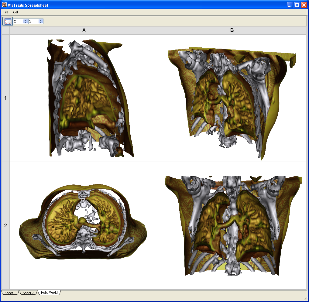 The VisTrails spreadsheet allows the user to compare visualizations produced by different workflows side by side. |